We caught up with our Senior Graphic Designer, Dan Maslanka, to find out more about the work that went into this creative branding project.
We were tasked with creating a new visual identity and the base of a brand to build credibility and trust for a company that offers building consultancy services in mechanical, electrical and public health services for architects, contractors, engineers and end users.
The brand needed to showcase the experience and knowledge of the people who are involved as, although it was a new name and brand, the people behind the name have been working in their fields for a substantial about of time.
With the task of delivering a new brand and identity, we did our research on the industry, mood-boarding what was visually common, what worked, didn’t work and extensive colour palettes.
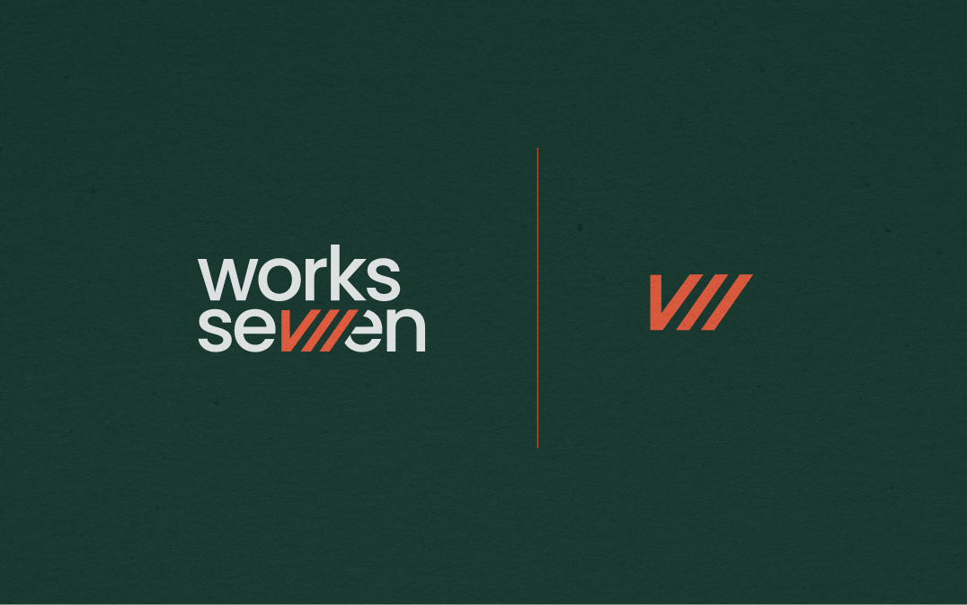
Initially, the brand name was written out as Works-7, with a hyphen connecting the two parts. The use of a hyphen felt like it was turning the name into a negative. Therefore, we decided to explore logo options with and without the hyphen to show how different the name could look and be created as a brand.
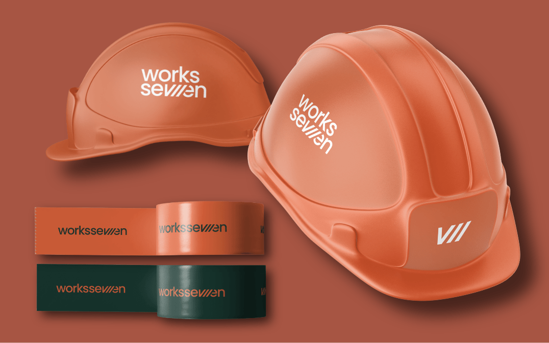
We wanted to be able to have the ease of seeing and reading the name, but also try to include a short-hand version or a mark of some kind to allow the brand to expand on different platforms and industries if needed.
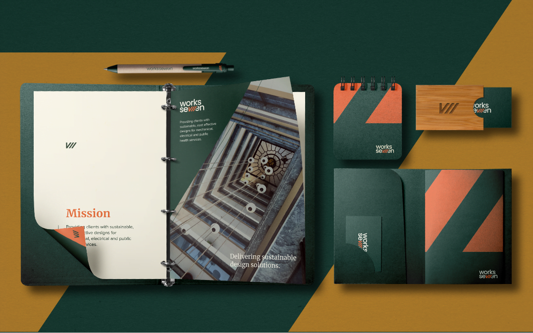
With branding, and especially brand identities, I like to sketch out the name or any potential ideas I have in my notebook. There’s something truly amazing about sitting back and drawing with a pencil and just seeing what happens.
A lot of things didn’t work and looked silly, but a lot of the sketches gave me different routes or ideas that stemmed into another idea. It becomes a personal and unique way of delivering the creation of the brand story.
With the ideas, I transferred them to the computer and illustrated them where needed, played with typefaces and layouts, and kept them all on one board. This then became a mood board for referencing and allowed me to use any elements for the brand in the future.
Having several ideas I liked, I picked three that would offer a different look or style and produced a concept brand look for each. Knowing that the client wasn’t sure on what style they specifically wanted to associate with, I believed it was the right decision to let them see options and gather their feedback and return with the final brand, with the knowledge that they have found the companies look and feel.
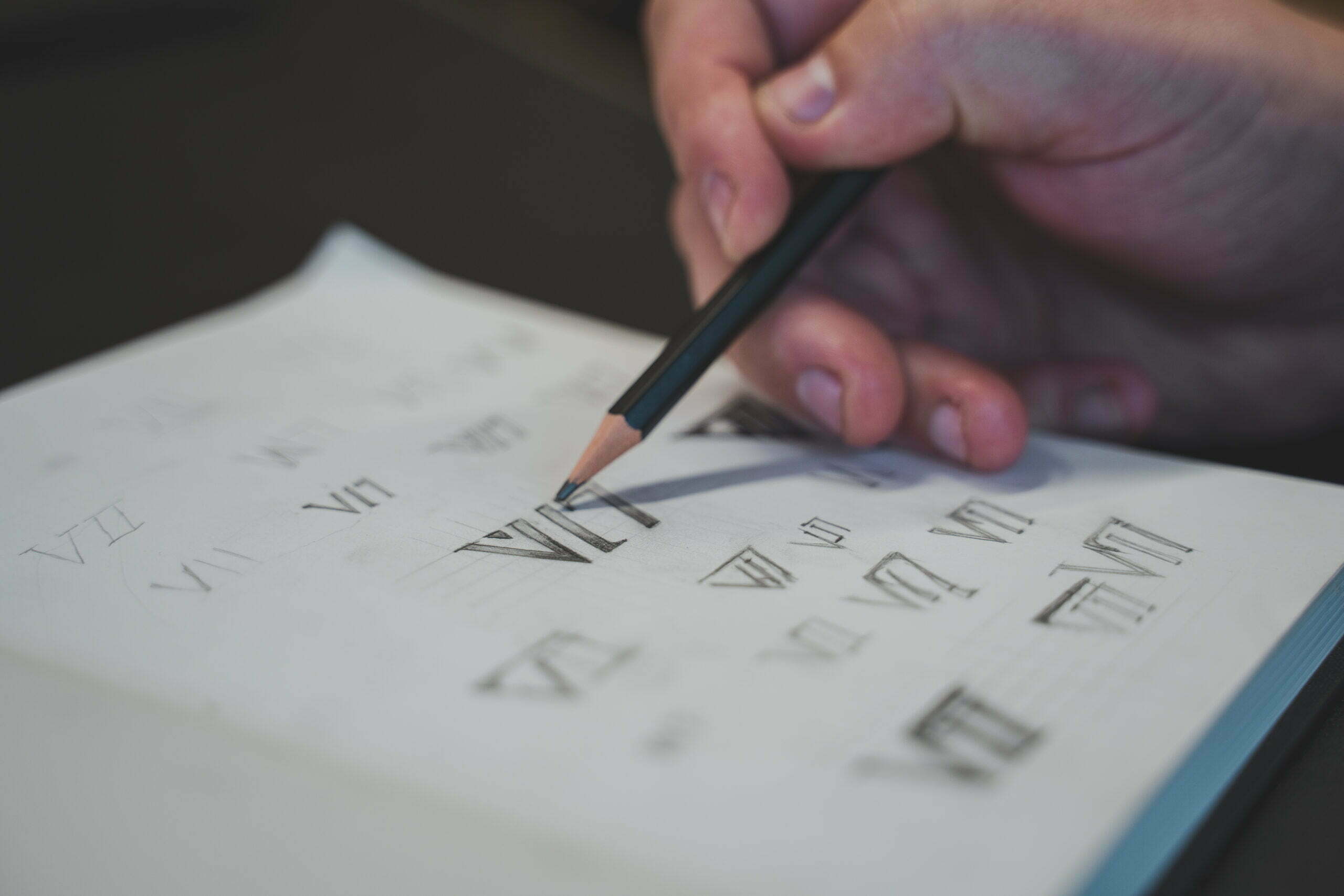
With any branding, the most difficult part is to tell the story of what’s been created. Sometimes it can be the identity, sometimes it can be doing so within the time frame of their existence. In this case, with it being a new company, for something that has technically existed for a long time, I wanted the brand to be able to tell the story of how experienced, knowledgeable and trustworthy they were in their field but also, allow the brand to feel modern and have a long life.
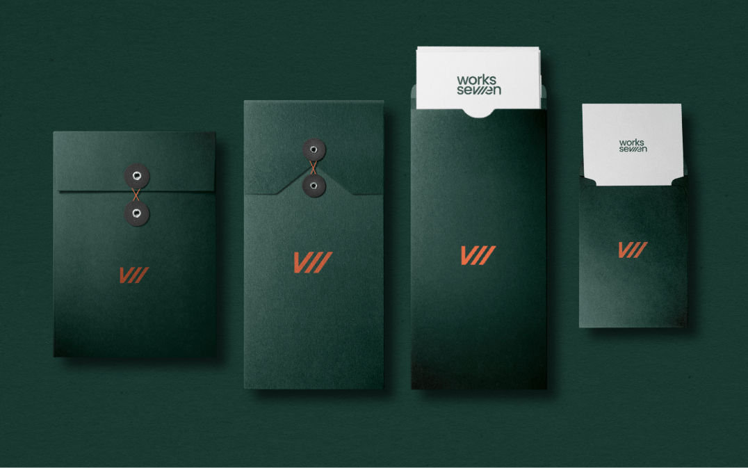
I felt that the combination of rustic and modern aesthetics was the best route to go down and, once I felt I had the right combination, the rest of the story flowed in the brand.
In this instance, the brand needed to be signed off by multiple individuals, which can sometimes be a hurdle in itself, but we made sure we organised regular review meetings and reveals where all members were available and could see what was being presented to allow a seamless progression in the sign-off.
Creating a brand in itself is always an exciting prospect for me. It’s a period of time where you can be in full creative mode and explore different ways of creation.
Being able to provide different concepts that showed the name without the hyphen and moulding it into the final piece, all whilst knowing that the client was excited at the prospect of all of the concepts, gives you a feeling of excitable tranquillity to proceed in the final direction.
But, for me, the most exciting part of the project – and in any brand project – is seeing the happiness and excitement in the room when the final brand is revealed. Yes, sometimes, that isn’t always the case, I know! But in this instance, the journey was a positive one and the final reveal was a great moment in this project.
As an individual, I was proud to be given the time to explore different ways of creating the brand.
Being able to use pencil and paper at the first stage is really important in my view, and this project allowed me to do that and evolve it into the final version.
I really like the way I have been able to combine a modern identity and mark but surround it with rustic elements to give the brand experience and simplicity.
If I could start the project again, I don’t think I would do much different. I would possibly like to explore a brand pattern and iconography in the earlier stages, but I know that is in the pipeline as we speak for the new website!